Lead UX Designer & Researcher
ROLE
Sep - Nov 2023
TIMELINE
Prototyping, User Interviews, UI
SKILLS
Figma, FigJam, Teams
TOOLS
OVERVIEW
An all-in-one UX hub 🚀
Userly is a webapp prototype designed for user experience designers to collaborate, make connections, learn, and find inspiration all in one place. In the fall of 2023, I pitched this as an idea to my Interaction Design II class at was chosen as a team lead. My team and I built Userly while loosely following the Lean UX framework and adapting it to fit our course timeline.
PROBLEM
Designers are spread out, lacking a centralized platform 🌎
As my team and I are all interaction design students, we know how difficult it can be to find information about design, make connections, share our work, and find advice all in one place. As the UX job market continues to stay rocky, we thought that interviewing designers and building a UX platform would, in turn, help us grow. We wanted to create a hub for designers where users can find and access everything design-related all in once place.
APPROACH
Making assumptions with Lean UX 💭
Lean UX is a combination of a few things: user experience design, design thinking, Agile software development, and Eric Ries’s Lean Startup method. The beginning of our project consisted of making assumptions about who would use our product, understanding our business outcomes, solutions, and more.
We worked through these questions by completing the Lean UX Canvas, which brings together a series of activities to help teams declare their assumptions about an initiative. We then validated and tested our assumptions over two, three-week sprints.
SPRINT 1
Week 0 — Solidifying our thoughts 📝
My team and I kicked off Sprint 1 by creating our Lean UX Canvas, a compilation of exercises that help teams lay out their assumptions about an initiative. We formulated a business problem, mapped out who we think our users would be, created hypotheses, solutions, and more.
As the team lead, I led and scheduled each meeting with my team. In meetings this week we asked ourselves questions such as: “What problem does the business have that you are trying to solve?” “What can we make that will solve our business problem while meeting the needs of our customers?” “What’s the most important thing we need to learn first?” and “What’s the least amount of work we need to do to learn the next most important thing?”
Product Problem Statement
We came to the assumption that the current state of the digital design community has focused primarily on specific parts of UX individually, such as UI, research, visual design, networking, and more. We believed our product would address this gap by providing an all-in-one hub for designers to connect, collaborate, and create with others of all skill and experience levels.
Proto-Personas
We assumed those who would be most interested would be inexperienced designers looking to grow and connect with others. We believed that designers are scattered online on various platforms, lacking a central “hub.”
We initially created three proto-personas. Sabrina, a new comp-sci college graduate with an interest in UX, Phillip, a mid-level designer in industry, and Sandra, a middle-aged marketing professional transitioning into the UX field. Although two represented junior designers looking to learn, we also wanted to include a full-fledged designer as we wanted a mix of career-levels to enjoy and use our product.
Sprint 1 Backlog
Once our Lean UX canvas was complete, we formulated our backlog, the features that we wanted to test during this sprint. We chose these features based on what we thought had the highest value but also the highest risk associated.
SPRINT 1
Week 1 & 2 — Testing wireframes 💻
During our first sprint, we interviewed participants who we thought identified with one of our three proto-personas. We interviewed 6 people: design bootcamp graduates, career-changers, college students, and full-time designers. Because we believed our product would mainly be used by inexperienced designers, we prioritized interviewing those with less experience. Every 2 days we held stand-up meetings where I delegated tasks to each team member.
What We Tested
Because we had to start testing and interviewing potential users right away, we had a team meeting at the beginning of the week where we all collaborated to whip up some lo-fi wireframes to show to our first participant.
As the team lead, I moderated each interview (which were all conducted on Microsoft Teams); I asked questions about their journey to design first and then showed them our lo-fi mockups and asked for their initial thoughts. After each interview, we continued to iterate on our lo-fi mockups based on feedback and patterns we saw. We focused on crafting lo-fi mockups of the features in our Sprint 1 backlog.
Affinity Mapping
After every interview my team and I went through the process of affinity mapping. Before we began, I posed questions such as, “What did you find the most interesting about the interview? What was the most important thing said about ‘X’ feature?” After our ten minute timer went off, we grouped our sticky notes based on observable patterns, helping us uncover what we thought were the most important parts of each interview session.
Sprint 1 Major Insights
01. Most participants prioritized the ability to post and communicate freely with others. We learned communication is an incredibly important aspect of a platform like this.
02. Many of those who are trying to break into design feel alone and lack guidance. They struggle with making connections with other designers and love the idea of mentorship.
03. Maintaining an online presence on various social media platforms can be tiresome; most participants used multiple different design-related platforms but only took one or two seriously.
Sprint Retrospective
At the end of Sprint 1 I held a sprint retrospective with my team, an hour long meeting where we discussed how we thought this sprint went. I realized that while moderating, I tended to save the most important tasks/questions for last which often cause us to not finish receiving feedback due to a lack of time. We also realized we needed to prioritize our group feature and develop a better understanding of how we wanted the social aspect of Userly to work.
SPRINT 2
Week 0: Revalidating our assumptions ✅
Sprint 2, Week 0 began with scheduling sessions with my team to go through the process of revalidation by revisiting some of our assumptions we made on our Lean UX Canvas. I led these sessions by asking my team, “What did we learn?” “What do we need to revisit?” and “What has changed?”
Removing Threads, Creating Groups
Through a few rounds of A/B testing during Sprint 1, we discovered:
Participants couldn't guess where the button “Threads” would take them
Everyone really liked the concept of help and feedback
The concept of “Groups” was easily understood
Participants preferred if feedback was integrated into “Groups” as Userly Community Groups
So, we shifted our desire of wanting an area where people can receive feedback on their designs, resumes, portfolios, and more into a group feature instead of its own element. We decided to split “Groups” into two types: organizational groups and Userly community groups to encompass organizations and community creativity.
Focusing on MVPs
We created a Sprint 2 backlog that highlighted the features we wanted to test and focus on. Elements in our hypothesis table changed as we omitted certain features in favor of others. Recognizing that open communication and easy collaboration are crucial to our platform, we decided to concentrate on formulating our group's functionality, resources offered, mentorship, and event features. Although we addressed some of these aspects during Sprint 1, we concluded that more time was needed to thoroughly test and finalize these features.
Proto-Persona Iteration
During this revalidation stage, we realized having three proto-personas was repetitive. Because we were interviewing only those who either had a job as a designer or were working towards becoming one, we decided to completely get rid of one of our proto-personas, Sabrina, as she was not an accurate representation of our research.
SPRINT 2
Week 1 & 2 — Testing our hi-fi mockups 👩💻
Sprint 2 worked in a similar manner as Sprint 1; we interviewed a total of six people, a mixture of bootcamp grads, college students, and full-time designers. We moved into higher fidelity mockups, adding in color and focusing on creating a more realistic-looking platform.
How We Tested
Like Sprint 1, I moderated each interview, starting out with asking our participants a few questions about their design background and then shifting into sharing my screen and showing them our mockups. We thought about going ahead and letting our participants click through our prototype themselves and possibly giving them a task list, but for the sake of time and ease I continued sharing my screen and going through the pages we wanted insight on. In hindsight, we probably should have tested a live prototype of Userly as Lean UX has no dedicated time to usability testing.
What We Tested
We tested higher fidelity mockups of our MVPs during Sprint 2. We created brand colors and typography which we used consistently throughout all screens. Although we created some hi-fi mockups of our entire platform, we focused on showing participants our MVPs in order to perfect the features we, and our interviewees, found most valuable. However, since our interviews tended to go over 45 minutes, if we had some extra time I also showed participants some of our other features we believed to have low risk, such as Home, Explore, Profile, and Messages, ensuring that we received feedback on all of our major navigational areas.
REFINEMENT
Polishing our designs, staying consistent 🎨
After Sprint 2 concluded, we spent a week refining Userly and making some final changes. We used this time to ensure we followed a relative 8pt grid on every screen, used color and text styles, and implemented auto layout.
FINAL RESULT
Userly, a hub for UX designers💡
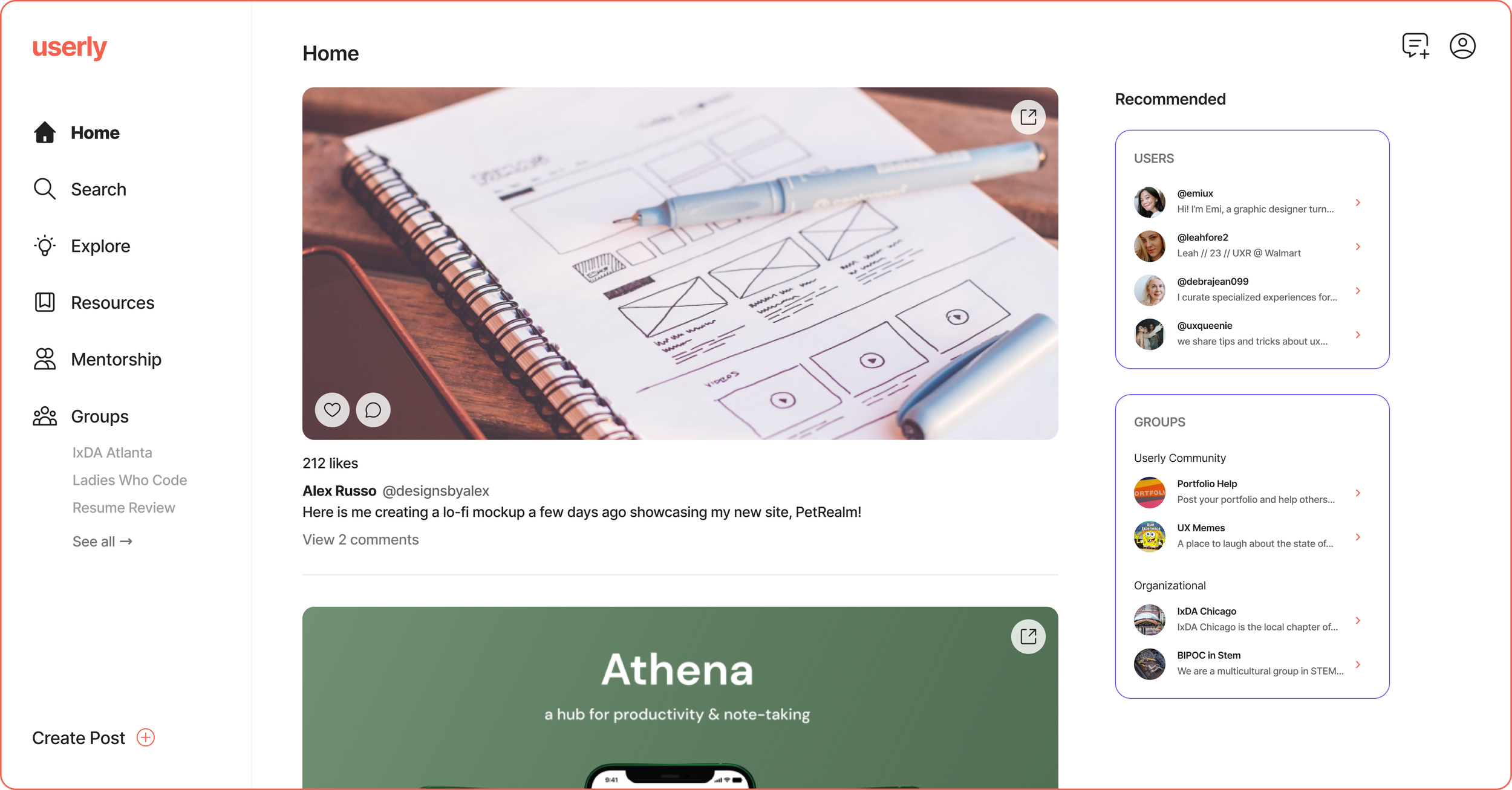
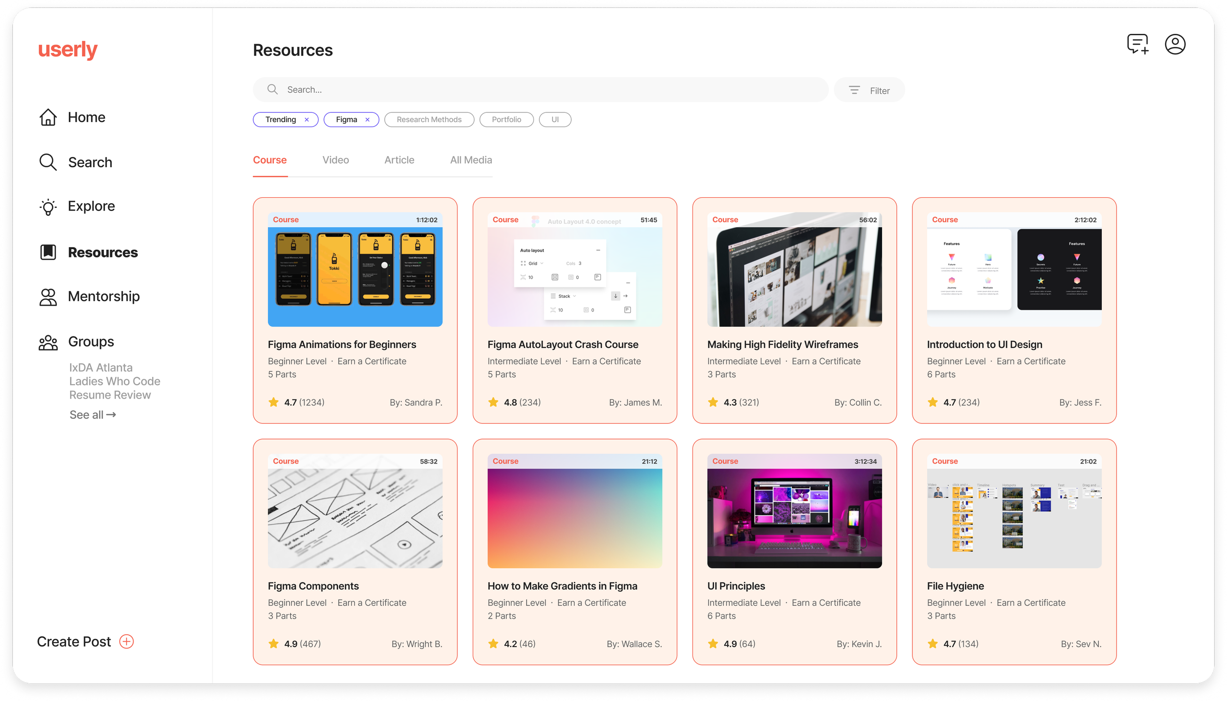
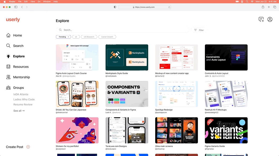
Home: View and engage with your friends' posts, find recommended users and groups
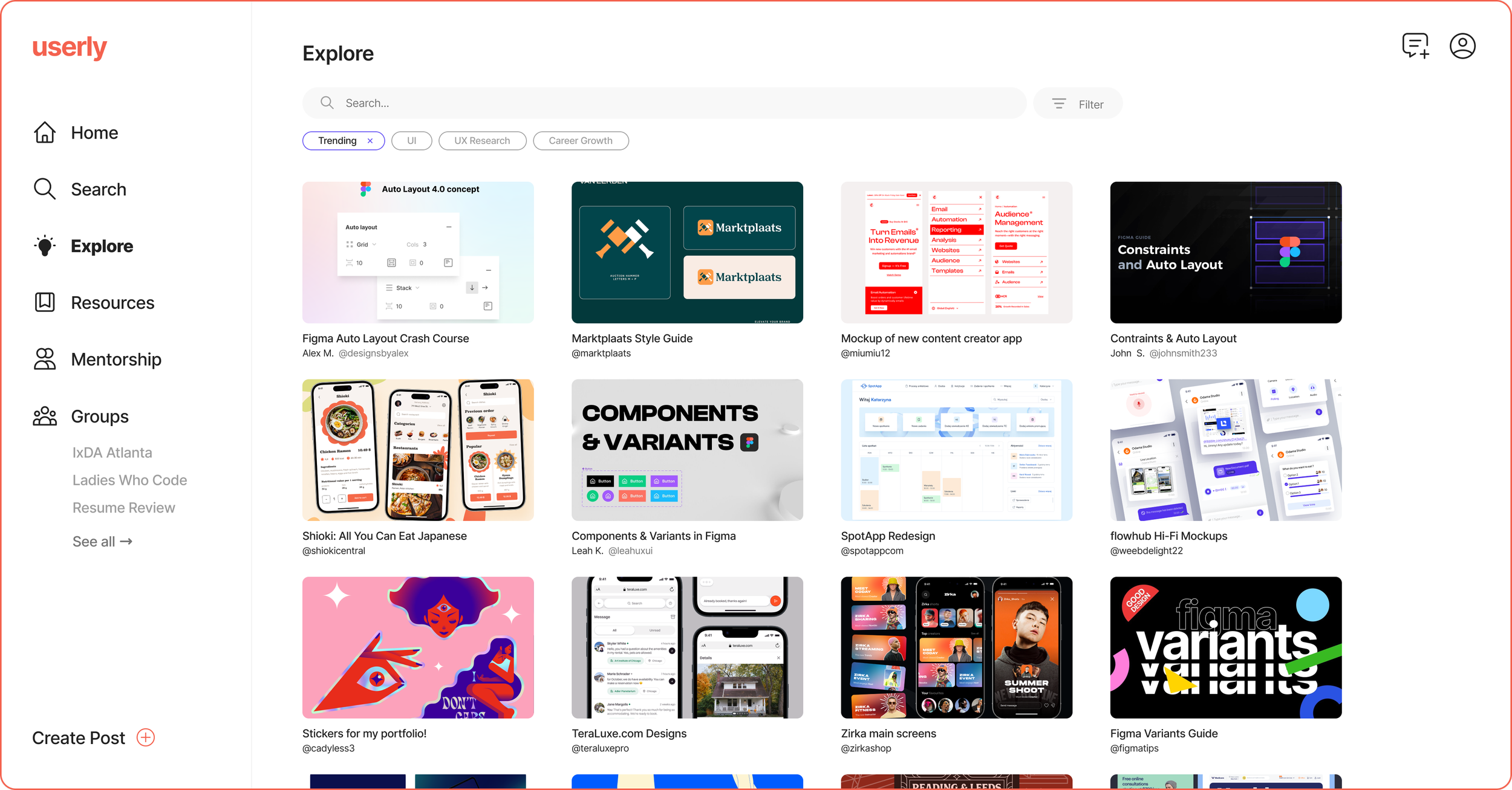
Explore: Share your work and find inspiration, discover what other designers are creating
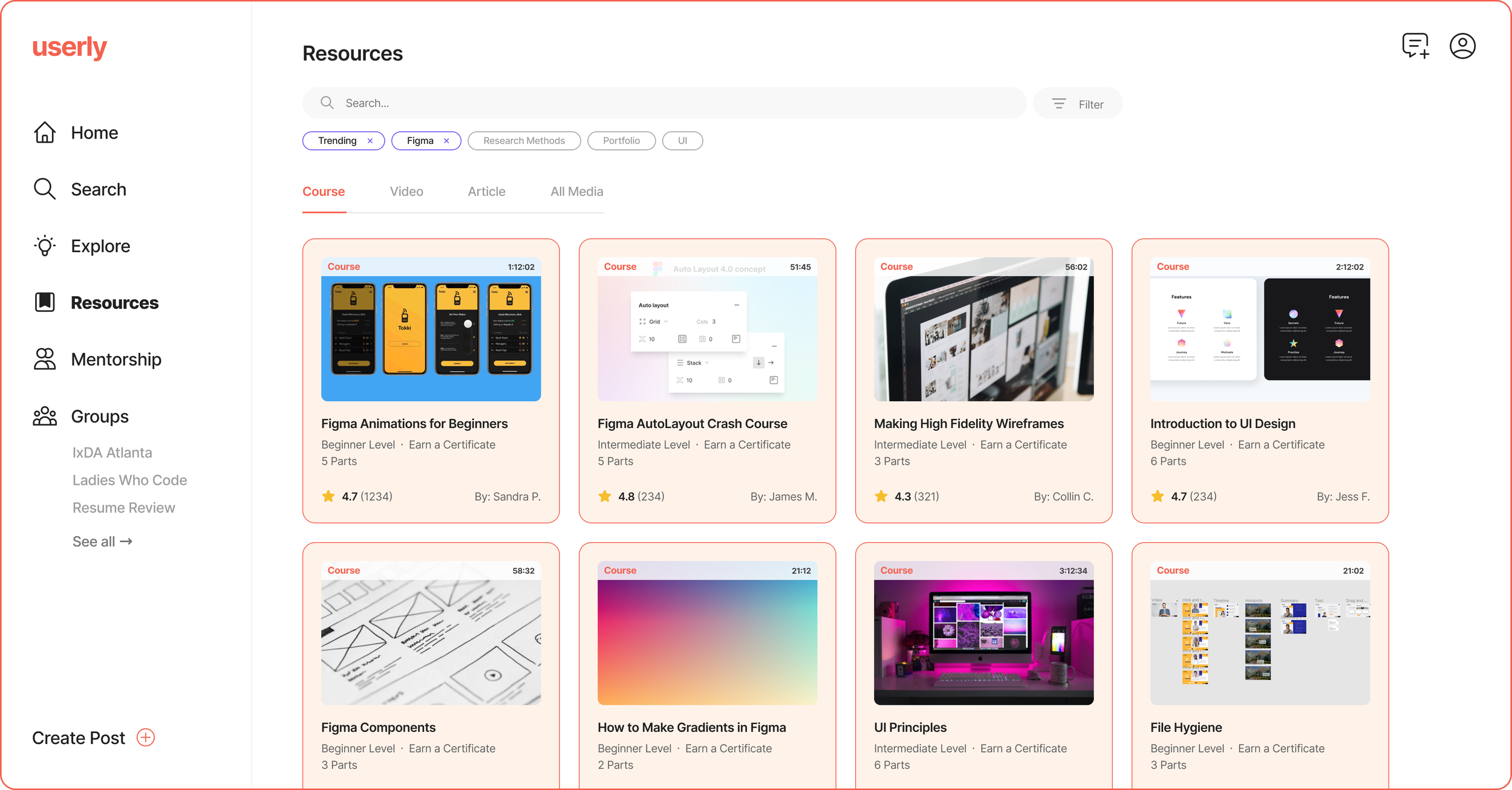
Resources: Learn something new via a course, video, or article
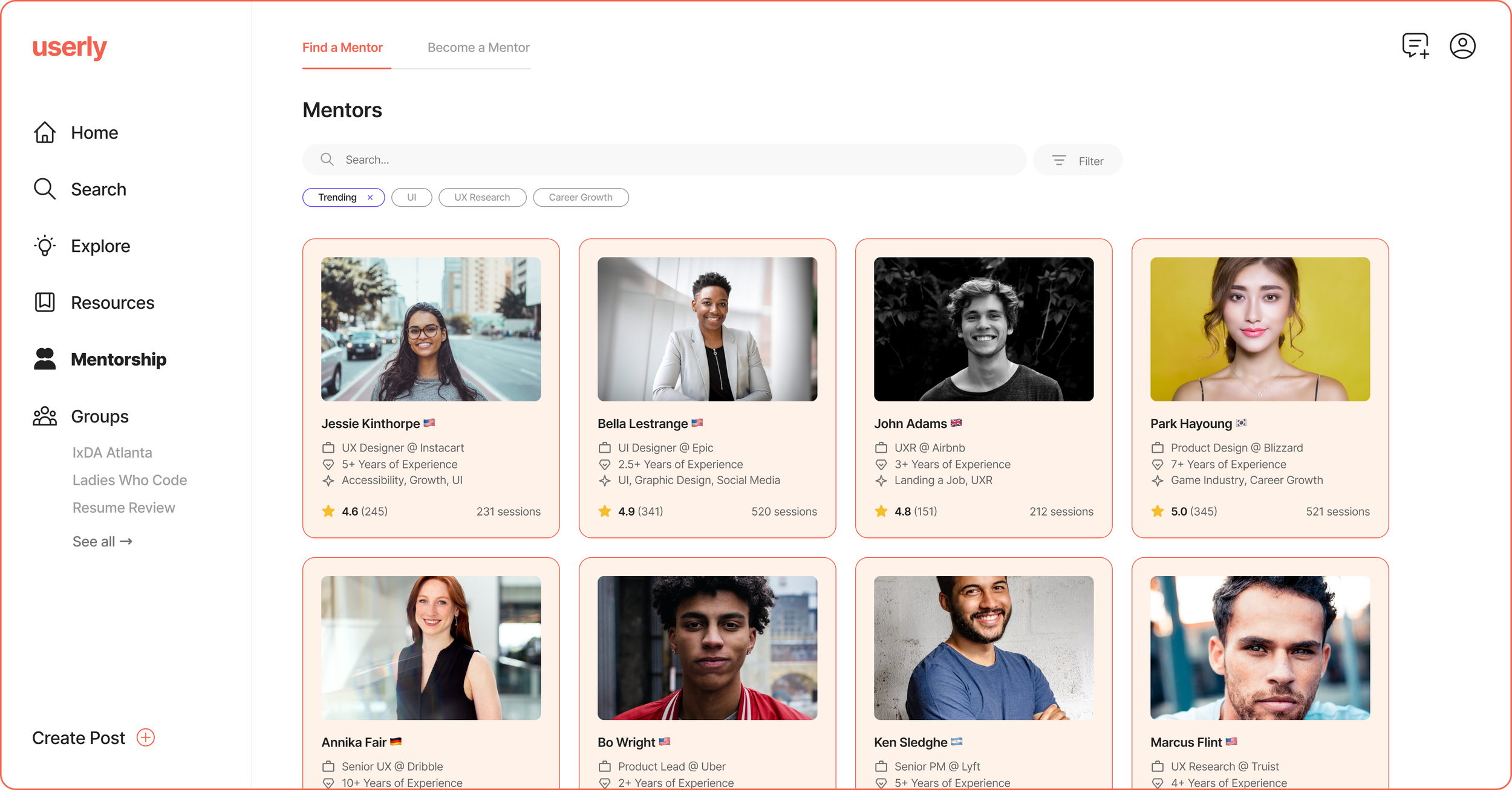
Mentorship: Find mentors or become a mentor, learn from the best and upgrade your skills

Groups: Join groups and form connections with others
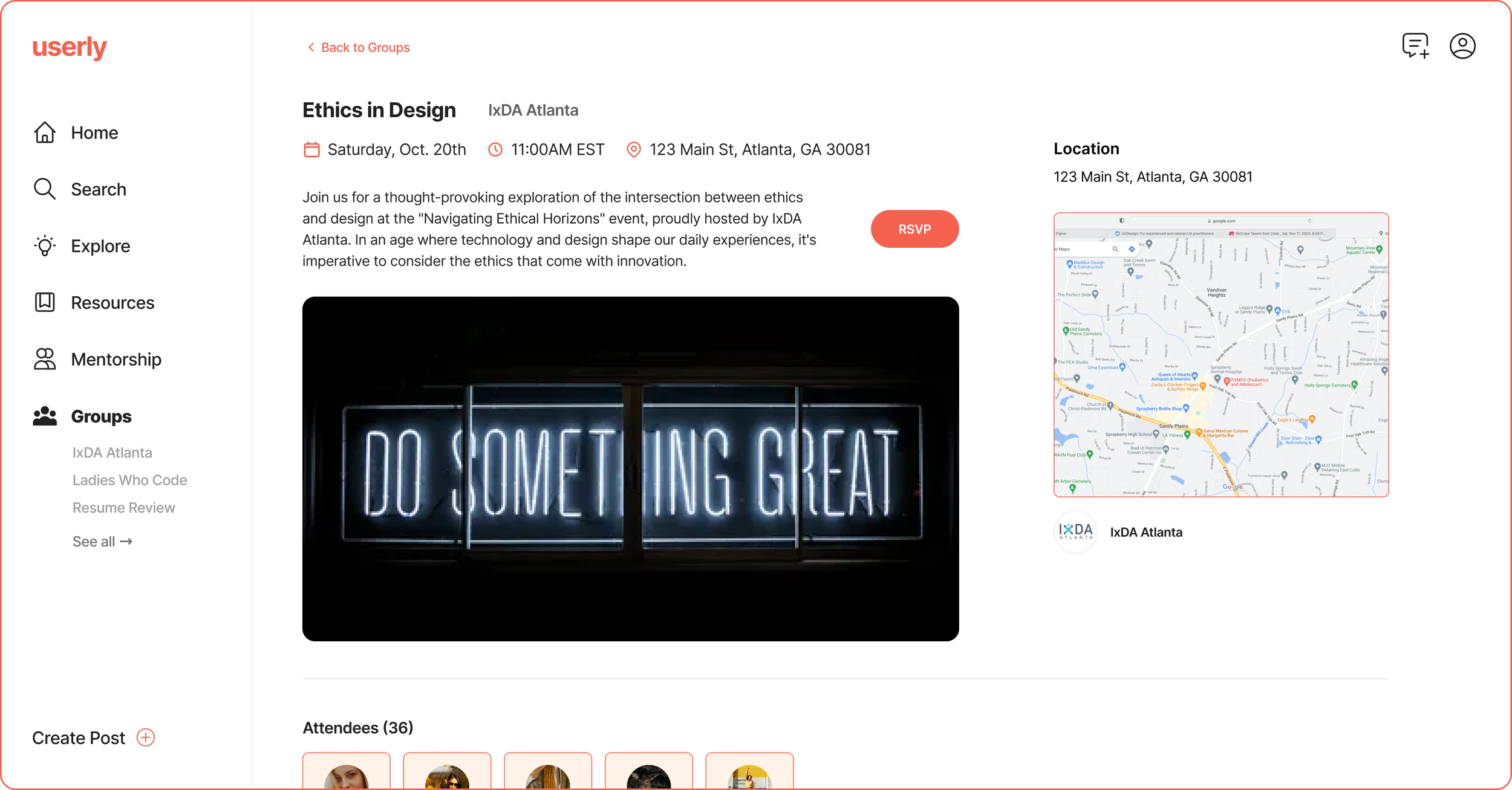
Events: Sign up for both virtual and in-person events, hosted by amazing groups
REFLECTING
Key takeaways as a design leader 💪
I truly enjoyed crafting Userly and working together with my teammates. Lean UX can be tricky, and although I was met with many challenges throughout this project, I learned a lot!
Learnings
01: Not everything has to be pixel-perfect. This was difficult for me to digest as I’m a bit of a perfectionist. However, in an environment where you’re pressed for time, not everything has to be perfect, and that’s okay.
02: Understanding the strengths and weaknesses of your team is important. Noticing what aspects of design, research, and collaboration each of my team members excelled in help me assign adequate tasks.
03: Repetitive and quick iteration can be fun. Although I had never worked on a project where we continuously updated and tested our designs, I found it to be rewarding to watch our assumptions either get quickly validated or invalidated.
03: Time management is crucial. This was the busiest semester for me personally, and the rest of my team was extremely busy as well. Finding common times where everyone can meet and chat was often difficult, and it was important for us to capitalize on our shared time.
04: I love moderating user interviews! After conducting twelve interviews, I feel much more comfortable talking and leading discussions with strangers. Learning more about how people think is fascinating, and one of my favorite parts of design.