Lead UX Designer & Researcher
ROLE
Jan - April 2024
TIMELINE
Goal-Directed Design (GDD)
SKILLS
Figma, FigJam, Adobe Illustrator
TOOLS
OVERVIEW
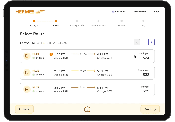
Hermes: kiosk design for America’s high-speed future 🚄
Hermes is a kiosk prototype for purchasing and viewing high-speed train tickets. As an avid public transportation enthusiast, and as the prospect for high-speed rail in the U.S. climbs higher, I wanted to create a design for kiosks in future stations.
After a trip to Japan in the fall of 2023, I fell in love with their bullet trains. I found Tokyo’s kiosks to be a bit outdated and clunky; while using them, I wished they were a bit more user-friendly, spurring an idea for my senior capstone project.
I led this project with the help of four other student designers for my senior capstone class, following the process of Goal-Directed Design (GDD).


BACKGROUND
The prospects for high-speed rail are increasing in the U.S. 📈
The United States of America lags behind in public transportation, especially in high-speed rail (186mph or more); we have yet to implement any high-speed trains in our transportation networks. However, there are recent projects in the works, such as Amtrak’s Acela trains, which are expected tp reach speeds up to 160mph. In the next few decades, the prospect of high-speed rail development in the U.S. is much higher than before.
DESIGN METHOD
Sticking with Goal-Directed Design (GDD) ✏️
My team and I followed the GDD framework for this project, created by Alan Cooper. As the potential for high-speed rail increases in the U.S., I wanted to create a kiosk design where people could purchase train tickets, scan QR codes, reserve seats, and more in a quick and intuitive manner.
Over the course of around three months, we designed Hermes by following the five phases of GDD:
MARKET RESEARCH
The kiosk market will grow by 12.3% in the next decade 🌱
Literature Review
We wanted to gain a comprehensive understanding of all aspects of Hermes’s domain, so we researched both the global and domestic public transportation industry (mainly high-speed rail) and the kiosk industry. We discovered the kiosk market is projected to grow by 12.3% during the 2021-2028 period; self-serve kiosks are becoming increasingly popular since the Covid-19 pandemic, often reducing the need for physical staff. We also found out that there are various high-speed rail projects in the work currently in the U.S., with Amtrak leading the current development of Acela trains. These projects expect to reduce road congestion immensely, lessening traffic and the number of accidents in busy cities.
Competitive Analysis
To better understand the market and the competition, our team selected some of the biggest train and kiosk companies in the world: Amtrak, Central Japan Railway Company, and KIOSK. Because there aren’t currently any high-speed trains in the U.S., our competitive analysis looked a bit different; we had to understand both the kiosk and the train markets.
Research Goals
Explore the strengths and weaknesses of the kiosk market
Identify the aspects of kiosks that users appreciate and dislike
Understand how high-speed train tickets are bought globally
Discoveries
Amtrak is the only rail service that offers trips throughout various different cities and states in America
Amtrak released their own kiosks, Quik-Trak, in 2021
Amtrak is the biggest passenger-carrying train company in the U.S.
USER RESEARCH INTERVIEWS
“I wish kiosks were less transactional and more interactive” - Dani 🤝
Dani, like many others in today’s world, have become familiar with kiosks; however, she wished they would feel less transactional. Before we began the user research process, we recognized that it’s important to know who to interview. So, we created a persona hypothesis to try and better understand who we should be interviewing.
Persona Hypothesis
What different sorts of people might use this product?
People commuting daily for work, long-distance commuters, people traveling domestically or internationally, anyone looking to travel (probably combine to be one or two personas).
How might their needs and behaviors vary?
Those who commute to work might follow a similar route every single day, while tourists might branch out more and purchase tickets from varying locations/cities.
What ranges of behavior and types of environments need to be explored?
Those who commute for work or always buy similar ticket routes may want it to be as quick and intuitive as possible, while tourists and other travelers may be looking for more features, find out more information. We will need to be conscious of how many types of people will use this and if their top goals differ.
Interview Sessions
We conducted five empathy interviews with potential users on Microsoft Teams over the course of a week. We looked for a mix of those who loved travel or are familiar with public transportation. In these interviews, my team and I asked questions such as, “What types of public transportation have you used?” “What are the most important factors you consider when purchasing transportation tickets?” and so on.
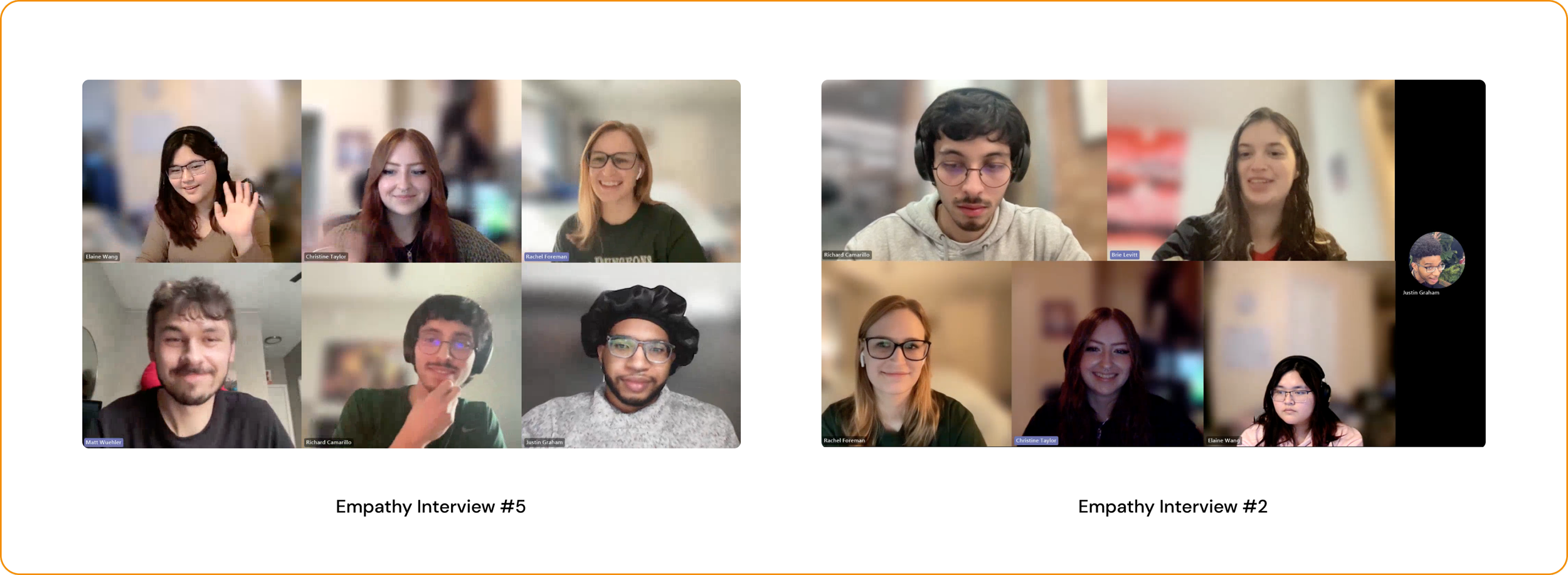
Affinity Maps
Following each interview, we all gathered together on Teams to analyze the results, utilizing a method known as Affinity Mapping. We took ten minutes individually to jot down important topics, thoughts, and facts brought up by the interviewee. Afterwards, we amalgamated our notes by categorizing the various subjects into broader groups. Similar patterns appeared across all five interviews; the process of grouping each interviewee’s thoughts and information helped us to make connections between them and see what they all did or did not have in common.

Observations
All five interviewees stressed the importance of the kiosk being intuitive. Because transportation is such a crucial part of most people’s lives, they all wanted the kiosk experience to be unobtrusive and easy. A few of the participants travelled by airplane pretty frequently, and expressed their love of the airplane ticket-buying process, claiming it was quick, painless, and made sense.
PERSONA DEVELOPMENT
The busy traveler 🚶♀️
Behavioral Variables
Our team compiled data from our five interviews and analyzed the answers to help reveal patterns of behavior. Using the affinity maps, notes, and other observations we noticed from our user interviews, we identified behavioral variables that they all shared:
Cost-aware (low - high)
Ease of use desirability (low - high)
Public transportation usage (low - high)
Persona
We decided that we only really saw one common pattern, most notably appearing among three specific participants. These participants all traveled frequently, cared about cost-comparisons, ease-of-use, and more when buying transportation tickets. Based on the information we compiled from our interviews, we created our primary persona, Artemis Hunter, who we modeled our entire design on, ensuring we always keep potential users’ needs in mind.
DESIGNING
Low-Fidelity
As team lead, I led my team through some initial lo-fi flow ideation, mapping out our validation and key path scenarios. We wanted to focus on the different paths users might take on our kiosk. Each team member grabbed an expo marker and started drawing on a whiteboard!
Ideation first, Figma second 🖊️
Mid-Fidelity
After brainstorming, we moved to FigJam to create some slightly higher-fidelity flows. We decided that our key-path scenario, the most well-worn path users would take, would be to purchase a train ticket. We also wanted to include validation scenarios, such as scanning a digital ticket to then print out a physical copy, edit ticket info, and more.
DESIGNING
Style Guide
As my team and I started to dive into Figma, we wanted to make sure we were all staying consistent as possible in order to create designs that looked cohesive. We chose orange and violet colors, picked the font Avenir, added some redlining, and picked a name: Hermes, modeled after the Greek god of speed and transportation.
Ensuring consistency 🎨


USABILITY TESTING
Tweaking animations and upgrading usability 🛠
Testing Process
After finishing our first iteration of Hermes on Figma, we recruited three participants to complete usability tests on our prototype to find any potential issues. We conducted all three tests in-person; I created a task list and provided a printed version to our participants to follow as they went through our prototype. They followed the TAP (Think Aloud Protocol) which helped us understand their thought process and pinpoint frustrations. Consent was given for images below.

Findings
Some animations were too quick to catch
After selecting a route/payment method, participants did not know how to move on
Certain buttons didn’t look clickable
Participants didn’t realize they had moved from outbound to inbound routes, or from passenger 1 and 2 when selecting seats to reserve as there was only a one word differentiation between screens
Refinement
Based on our participants’ feedback, we hopped back on to Figma and made a few changes to our prototype:
When a user selects a route or payment method, it lights up, then after delay moves them to the next page automatically
Added confirmation pop-up for seat reservations, and a “Moving to Passenger 2…” when buying tickets for more than one passenger

Before Usability Testing

After Usability Testing
FINAL PROTOTYPE
Based on our market research, user interviews, modeling, wireframing, usability tests, and more, we created Hermes: kiosk design for America’s high-speed future. With Hermes, users can purchase high-speed train tickets, reserve seats, compare prices, and more!
Hermes 🚀


REFLECTING
Leadership is tough, but rewarding ✨
Design is incredibly complex. Leading a team through the process of creating an app based on GDD taught me an immense amount about UX, collaboration, and leadership.
Learnings
01. Leading a team can be difficult, but incredibly rewarding. I was able to watch my teammates grow and help them capitalize on their strengths and recognize their weaknesses. I really, really loved getting to know my team and learning how to be a better leader for them.
02. The importance of styles and UI guidelines. I followed a relative 8pt grid and made sure all of my text and colors were established styles or variables; organization was a priority, and it resulted in a very clean Figma file!
03. User research is crucial; the data we gathered from our five user interviews carried our entire design process afterword. If we had more time during our research phase, I would have wanted to interview a more diverse group of people in age, ethnicity, and gender.
04. Usability testing is vital and helps uncover so many possible issues spawned from unknown biases. If we had more time, I would have liked to conduct five tests instead of three. I felt like our feedback was limited due to participants being more reserved.